Saturday, 9 November 2013

Sssh, but Christmas is round the corner

Christmas, I have a bit of a love hate relationship with Christmas. Sometimes I can be really enthusiastic about it, want to decorate the whole house, cook loads of yummy food and try not to buy even more Christams baubles in a new colour scheme (I have 3 large plastic boxes of baubles that really is enough for one house isn't?).

And then some years I could beat Scrooge for a bah humbug viewpoint.

It drives my husband insane, but he loves me and puts up with it.

This year I have a feeling it could be the whole full on Martha Stewart, Good House Keeping homespun chic DIY fabulous designer "oh I just knocked this together in a couple of hours" expereince as I've made this and it isn't even November (well it is now but I made it when it was still October).


I bought this MDF cut out last year and didn't do anything with it (it was a Scrooge year).

I knew I wanted to create a sort of shabby (nothing new there then) natural look. Distressed layers with touches of gold. 

I started off painting it all ovr with PaperArtsy Claret Fresco paint.  Then added a lyer of Old Gold.over that.

Next a layer of Crackle Glaze.

Over this  layer of Nougat and Snowflake, not too thick as I wanted fine crackles.

Then some sanding to distress the edges and on the top to remvoe some of the crackle so it looks like peeling paint. 

Treasure Gold (i think Renaissance), bit more Claret and Vintage Photo Distress Ink in places especially on the edges just to shabby it up.

Over all of this I added a layer of Metal Glaze mixed with a small amount of Old Gold.  It really dirtied up the colour and added to the aged look.  

A little bit of text stamping in Claret and finally I sprayed watered down Snowflake across it to add spots of white.  

The more thin layers of colours you add to a piece can really add tone and depth as can sanding to reveal base layers of colour - my favourite way of creating!

So, onwards then to continue creating my scandanavian shabby Christmas, migh have to orgainse a drinks party to show it all off!  

Hugs
Jo
xx


Sunday, 3 November 2013

I tried ....

I did, I really tried to do a clean and simple inspired by Jo Wardle Guest Designer pieces over at PaperArtsy, but I just couldn't stop myself from adding texture!.

So here's a failed inspired by Jo Wardle, but it's a pretty good inspired by Jo Myhill don't you think?

It's the usual culprits of PaperArtsy Fresco paints in the orange / brown autumn inspired palette and I really like the Vintage Lace panel in the middle to contrast against the Krunchy Waxed Kraft Paper leaf. The Walnut Distress /ink over the top of the crunches really shows the texture and gives it that natural look.

Yet again it's a shame you can't actually get to look at this in real life and see all the grungy texture from the Grunge Paste and how watered down Fresco paints really move around and soak fabric beautifully.  I also really enjoyed spraying the paints as well and I'm currently trying that out more on a work in progress.

Right the whole day is ahead of me and I have two projects on the go, Sunday lunch to cook and a game of rugby to watch this afternoon. 

It's a hectic life sometimes.

Hugs
Jo
xx


Friday, 1 November 2013

Still obsessed with hearts

I quite like Autumn, the colours the sharp nip in the air, but boy I don't enjoy going to work in the dark and travelling home from work in the dark - I miss daylight and it plays havoc with crafting as taking decent photos to blog with is frankly hard work.  I have been known to take art work into work to photograph in my lunch break I'm that desperate sometimes.

Anyway today I have a day off work to play crafting catch up and that includes photographs (it's a brightish day so great light), blogging, oh and some craft as well (really need to crack on with those Christmas cards).

So yes I still appear to be a bit obsessed with hearts. 

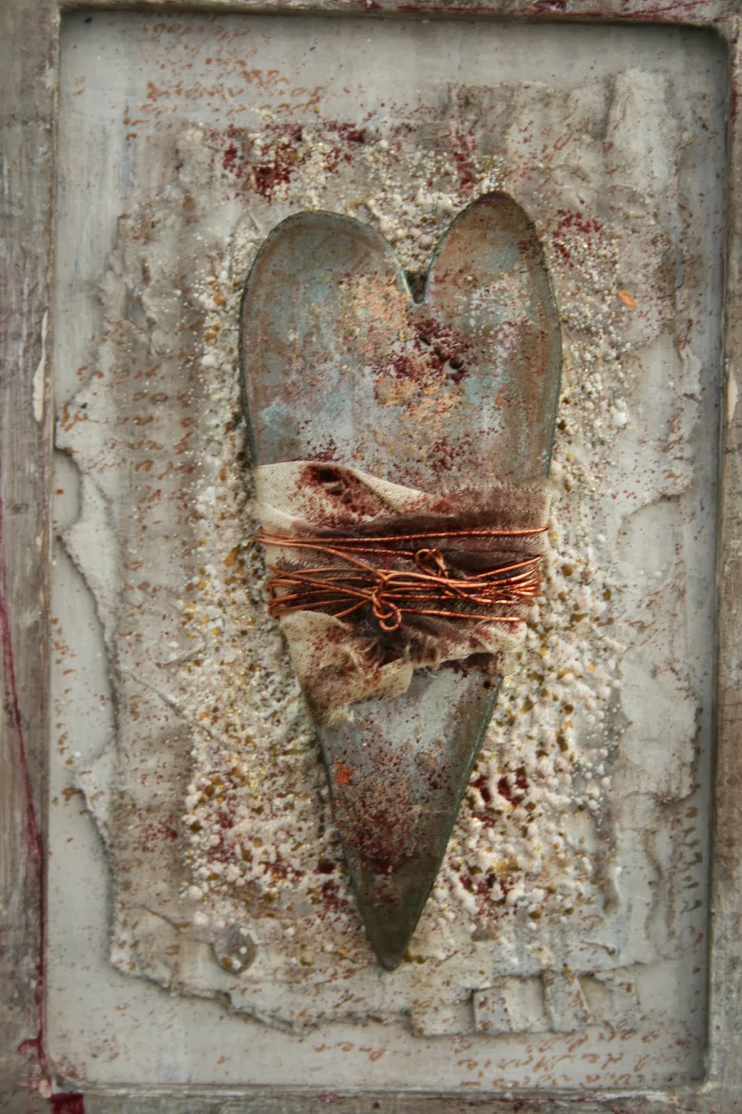
I made this quite a while ago in terms of the background and the frame.  It's my usual distressed texture style. The frame had layers of PaperArtsy Fresco paint on in a neutral palette, rubbed back in places and little bits of embossing powder on it.

The centre piece had a lot of Frantage embossing powders added over the corrugated card which again had been lightly painted in neutral PaperArtsy Fresco paints.

It had something else in the middle (fabric and paper stitched together with a small piece of driftwood) that looked ok, but just wasn't quite right and every time I looked at it I sighed and pulled a face.

So I ripped off the middle bit and had a re-think. 

I had some spare hearts cut from Grunge Paper knocking about from a previous project so I played around with these adding more distressing with paint and powders and wrapped some strips of silk and wire round them. 

And again it sat in my craft room and I looked at it and sighed and pulled a face. Not quite as bad as last time, but yes, it still looked too "clean" especially the copper wire.

So this morning I carefully dripped some Hazelnut Alcohol Ink on the wire and silk and added some burgundy WOW embossing powder to the heart.  I also sprinkled a bit of the embossing powder on the corrugated background. And then added some light swipes of Plum Archival Ink on the frame to tie in the colours.

Now I look at it and smile, it's dirty enough to make me happy.

hugs
Jo
xx


Sunday, 6 October 2013

It's a tactile thing

I am still really enjoying creating texture, it's just a shame you can't get to see this in real life and touch it because it is full on 100% oozing texture!

This started out as a plain 5" x 7" canvas, but you will not believe how many layers of paper and texture paste this has had on it (well you might if you know my work well).  This is the third layer of art on this canvas and the previous layers (which I just paint over when it isn't quite working and start again) have added to the strength of the canvas.

I painted over what was there before (text paper, old grunge paste, some paint and goodness know what else) with gesso, only a light layer as I didn't want to mask the texture just give me a neutral colour base to work on.

Then a layer of Grunge Paste scraped on with a spatula, not all over the canvas, very messy and definitely not smoothed out.  

I bought a new product recently to give me some more grainy texture.  It's called Sand Texture Gel and well that's pretty much what it is. This was applied on the right hand side of the canvas. Let this all dry to give you a really interesting base to work with colour on.

I used the new Caramel, Toffee and Tango Fresco paints with Vanilla and Autumn Fire to add colour.  Did some flicking to get spots of colour and stamped Mini 23 in Archival Monarch Orange.

The fabric is cream sari silk that I dyed with watered down Fresco paints and then stitched onto felt and cut up and re-stitched together! Little bit of Antique Photo Distress Ink around the edges and then sprinkles of Stampendous Fran-tage Embossing Enamel in Aged Scarlet.

Some stitched fabric and paper for the central piece with more watered down Fresco in Rose and the lovely new Mini 96 flourish stamped in Archival Potting Soil.

The heart was painted with Nougat and Rose Fresco, more Stampendous Fran-tage Embossing Enamel in Aged Scarlet melted on it.  Then it was sanded and inked with Antique Photo Distress Ink to complete that shabby look.

The canvas background really looks and feels like weathered sandstone (we have a lot of it here in Northamptonshire) and I still love using ripped and cut fabric in this way with paint and silky coloured thread to add even more texture. 

It really is a shame you can't touch it through the magic of the Internet!

hugs
jo
xx    


I'd like to thank ....

Wow and wow again. 

It's been really hard work keeping it a secret that I was one the new guest designers for PaperArtsy and probably even more nerve wracking planning, designing and writing up my three first pieces.

Hidcote Manor June 2013
I have been overwhelmed and very humbled by all the positive responses I have got from everyone who has looked and commented, so a big thank you to you all.

I really appreciate it.

Putting your work out there and getting feedback both positive and constructive is really important. It's how we grow, it's how we stretch ourselves, it's how we learn.

My day "job" is in a University and this week I have been meeting new students to tell them how the library can and will support their learning, how much learning is a creative interactive energising process and having the opportunity to learn is one of the most precious gifts we can have in life.  Wanting to learn should never leave us and that's why it has been great this week to share my enthusiasm for learning in both my day job and my crafting life.

If you haven't looked at my guest designer week these are the links:

Project 1
Project 2
Project 3

I'm really looking forward to my next designer week and have already got some great ideas to share with you.

hugs
jo
xx

Wednesday, 25 September 2013

Still kicking that seaside vibe

Well I so enjoyed the colours on the last piece I made with JOFY seaside stamps, I needed to do some more.

I used the same Green Olives, Tinned Peas, Sage and Concrete PaperArtsy Fresco paints colour combo on this square canvas.

I also added some stencilling with Grunge Paste(gotta have some texture!)

The wooden fence is actually lolly sticks that I wiped Sage and Concrete lightly with Cut-n-Dry.  Cut the ends and then used rusting powder to distress further.

The little row of beach huts were stamped on a scrap of patterned paper that I'd swiped some Concrete on and them stamped and embossed with brown embossing powder and cut out. 

These were stuck onto a scrap of linen that had a little bit of Walnut Stain smeared over it and finally the sentiment added on a scrap of the patterned paper.

A tiny smidge of Sherbet over the stencilling just to add some contrast  and pick up some of the colour on the patterned paper just finishes it off I think.

Really pleased with the rusty fence, I think it looks great as another layer of texture on the canvas and continues the beachy theme.

I've added another photo in to show how sunny it was on Sunday (husband was happy as he could keep his shorts on for WW weigh in, he's dreading having to be weighed in jeans and suffer a bit of a gain!) and how the colours look so different 

Well until next time, hope you are all enjoying playing with your stash from your latest shopping venture wherever that may have been (clears throat to admit I haven't put mine away from Ally Pally yet ...).

hugs
jo
xx

Thursday, 19 September 2013

ssssh, it's been a bit quiet round here lately

Yes I know I haven't posted in ages but I've been rather caught up in changing habits of a lifetime and creating a new lifestyle.  Both husband and I have decided that enough is enough and we need to eat smaller portions and move a lot more.  So that's what we've been doing, between us we have lost over 30lbs in 7 weeks and visiting the gym on a much more regular basis (they don't laugh now when we get our cards out as there is no dust flying out as well through lack of use).  This week I have started the excellent NHS couch to 5k running programme (aren't pod casts great) and a new weights regime.  I can't quite look at myself in the mirror when I'm lifting the weights as a) I'm trying to concentrate on breathing right b) I forget to breathe and go red and c) I'm sure I'm pulling right gurning faces as I lift the weights above my head and that will make me laugh and possibly drop the weights.


But last weekend I did manage to do some art and here it is using the fabulous JOFY stamps from PaperArtsy.


Rather than a beach scene I ended up making it look like a garden shed, but that's the versatility of the stamps.  

This one is JOFY Mini 23 which I stamped on a ripped out book page lightly painted on Concrete, stamped in black and then painted in Sage and Tinned Peas (sometimes neat sometimes mixed) . 

The really deep mini canvas was painted first in Tinned Peas, Crackle Glaze layer and then in Concrete and Sage mixed.  

Sanded on the edges and then stamped using the large clocks stamp from Clock Plate 2 and embossed with green  embossing powder. Some beautiful lace on the edge, ripped crunchy waxed craft paper and string and finally some buttons and some driftwood.

Well here's hoping I can manage to find a balance between eating less, moving more and crating as well!

hugs
jo
xx