Gosh it feels good to be able to craft in daylight.
The dark evenings of winter really do really put a halt on my mixed media crafting, doesn't stop me knitting or crocheting though in front of the telly. the long Christmas break I've got means I can spend some time to relaxing in my craft room (well I can now it's tidy again and I can actually see the floor and the table).
I've had this canvas for a long time. It has some Grunge Paste stencilled on it and a lace panel and then it had numerous layers of different colour schemes on it as I tried to make it work. It got slung to one side on many an occasion, forgotten and forlorn just like old Cinders.
I found it again whilst tidying and decided I would give it one more go. I've also decided that I want to use up my scraps and if I don't use then up THEY ARE GOING IN THE BIN! I know harsh words but too much clutter around me stops my creative flow so it's a case of use it or go.
I pulled out some thin patterned paper scraps and ripped them into strips then with watered down PVA I just started sticking them on over the centre of of the canvas building up layers and texture. Once they were dry I ripped some patterned paper into squares and stuck these over the top of the strips - nothing neat or ordered about it, just keep adding layers.
 Once this was dry I went over the top in Mushroom and they watered down Nougat, concentrating the Nougat in the centre. Around the edges to catch he Grunge Paste I dry brushed Toffee and Cinnamon. If it was a bit too dark I added some Nougat.
Over the central panel I painted Caramel in three strips. I started painting at one end with a dry brush and then I wet my brush wiped the excess off on kitchen roll and then went back over the paint to move the paint around. to create pale strips of colour. I didn't want it too opaque hence the water, but I did want to see it. Once this was dry I dry brushed Toffee and Cinnamon to catch the edges of the ripped paper. I then added a tin wash of Nougat just to blend it all in and make if "soft".
Once this was dry I went over the top in Mushroom and they watered down Nougat, concentrating the Nougat in the centre. Around the edges to catch he Grunge Paste I dry brushed Toffee and Cinnamon. If it was a bit too dark I added some Nougat.
Over the central panel I painted Caramel in three strips. I started painting at one end with a dry brush and then I wet my brush wiped the excess off on kitchen roll and then went back over the paint to move the paint around. to create pale strips of colour. I didn't want it too opaque hence the water, but I did want to see it. Once this was dry I dry brushed Toffee and Cinnamon to catch the edges of the ripped paper. I then added a tin wash of Nougat just to blend it all in and make if "soft".
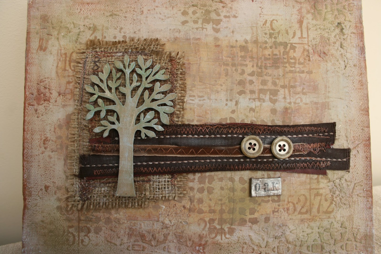
 I added some stencilling in Irish Cream and Mocha Mouse with a large fat stencil brush.
The Artemio tree was first painted in Caramel and then Nougat. A little bit of gentle sanding and then Tinned Peas gently added with the stencil rush. the excess Tinned Peas was added to the corners of the canvas on the Grunge Paste areas. Really lightly and softly so it just catches your eye and linked to the green on the tree. Over the Tinned Peas I added Treasure Gold in Aquamarine and White Fire. then Nougat was dry brushed on the leaves and trunk.
I sewed some Hessian oblongs together and then created a strip of various ribbons. Sewed two buttons on. The oak plague was made from an old piece of mocha metal that I sanded and then stamped the letters. I folded the edges over to give a neat edge. (Oak was the house I was in at school, it seemed appropriate).
I have to say I really love how this Cinderella canvas turned out. The colours tone so beautifully and subtlety and the various textures of paper, Grunge Paste, ribbon, Hessian and wood come together as one piece but equally are beautiful in their individual way.
Right having flexed the creative part of me this morning I'm now off to indulge in my other passion rugby this afternoon - at least its not raining!
hugs
jo
xx
So here is my second project this week over at the PaperArtsy blog.
Similar themes of texture using Grunge Paste, paint and tissue paper. This time the tissue paper is used in a different way to create even more texture.
Do go take a look if you haven't already.
Hugs
Jo
xx
Helloooo!
Well its that time of year again when my crafting activity gets shoved to one side a bit.
I find it really difficult to get inspiration in the dark evenings which only leave the weekends for paper crafting and then all the weekend house stuff gets in the way!
But we've turned the corner in terms of the shortest day and we can start to look forward to more light -hurrah!
Mind you I have been crafting in my role as guest designer over at PaperArtsy. It's my final slot of the term this month so do please pop over to see what I've been making.
hugs
jo
xx
Christmas, I have a bit of a love hate relationship with Christmas. Sometimes I can be really enthusiastic about it, want to decorate the whole house, cook loads of yummy food and try not to buy even more Christams baubles in a new colour scheme (I have 3 large plastic boxes of baubles that really is enough for one house isn't?).
And then some years I could beat Scrooge for a bah humbug viewpoint.
It drives my husband insane, but he loves me and puts up with it.
This year I have a feeling it could be the whole full on Martha Stewart, Good House Keeping homespun chic DIY fabulous designer "oh I just knocked this together in a couple of hours" expereince as I've made this and it isn't even November (well it is now but I made it when it was still October).
 I bought this MDF cut out last year and didn't do anything with it (it was a Scrooge year).
I knew I wanted to create a sort of shabby (nothing new there then) natural look. Distressed layers with touches of gold.
I bought this MDF cut out last year and didn't do anything with it (it was a Scrooge year).
I knew I wanted to create a sort of shabby (nothing new there then) natural look. Distressed layers with touches of gold.
I started off painting it all ovr with PaperArtsy Claret Fresco paint. Then added a lyer of Old Gold.over that.
Next a layer of Crackle Glaze.
Over this layer of Nougat and Snowflake, not too thick as I wanted fine crackles.
Then some sanding to distress the edges and on the top to remvoe some of the crackle so it looks like peeling paint.
Treasure Gold (i think Renaissance), bit more Claret and Vintage Photo Distress Ink in places especially on the edges just to shabby it up.
Over all of this I added a layer of Metal Glaze mixed with a small amount of Old Gold. It really dirtied up the colour and added to the aged look.
A little bit of text stamping in Claret and finally I sprayed watered down Snowflake across it to add spots of white.
The more thin layers of colours you add to a piece can really add tone and depth as can sanding to reveal base layers of colour - my favourite way of creating!
So, onwards then to continue creating my scandanavian shabby Christmas, migh have to orgainse a drinks party to show it all off!
Hugs
Jo
xx
I did, I really tried to do a clean and simple inspired by Jo Wardle Guest Designer pieces over at PaperArtsy, but I just couldn't stop myself from adding texture!.
So here's a failed inspired by Jo Wardle, but it's a pretty good inspired by Jo Myhill don't you think?
It's the usual culprits of PaperArtsy Fresco paints in the orange / brown autumn inspired palette and I really like the Vintage Lace panel in the middle to contrast against the Krunchy Waxed Kraft Paper leaf. The Walnut Distress /ink over the top of the crunches really shows the texture and gives it that natural look.
Yet again it's a shame you can't actually get to look at this in real life and see all the grungy texture from the Grunge Paste and how watered down Fresco paints really move around and soak fabric beautifully. I also really enjoyed spraying the paints as well and I'm currently trying that out more on a work in progress.
Right the whole day is ahead of me and I have two projects on the go, Sunday lunch to cook and a game of rugby to watch this afternoon.
It's a hectic life sometimes.
Hugs
Jo
xx
I quite like Autumn, the colours the sharp nip in the air, but boy I don't enjoy going to work in the dark and travelling home from work in the dark - I miss daylight and it plays havoc with crafting as taking decent photos to blog with is frankly hard work. I have been known to take art work into work to photograph in my lunch break I'm that desperate sometimes.
Anyway today I have a day off work to play crafting catch up and that includes photographs (it's a brightish day so great light), blogging, oh and some craft as well (really need to crack on with those Christmas cards).
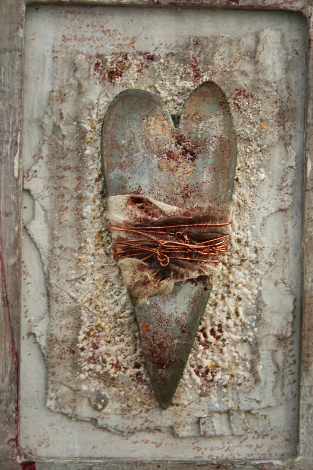
 So yes I still appear to be a bit obsessed with hearts.
I made this quite a while ago in terms of the background and the frame. It's my usual distressed texture style. The frame had layers of PaperArtsy Fresco paint on in a neutral palette, rubbed back in places and little bits of embossing powder on it.
The centre piece had a lot of Frantage embossing powders added over the corrugated card which again had been lightly painted in neutral PaperArtsy Fresco paints.
It had something else in the middle (fabric and paper stitched together with a small piece of driftwood) that looked ok, but just wasn't quite right and every time I looked at it I sighed and pulled a face.
So yes I still appear to be a bit obsessed with hearts.
I made this quite a while ago in terms of the background and the frame. It's my usual distressed texture style. The frame had layers of PaperArtsy Fresco paint on in a neutral palette, rubbed back in places and little bits of embossing powder on it.
The centre piece had a lot of Frantage embossing powders added over the corrugated card which again had been lightly painted in neutral PaperArtsy Fresco paints.
It had something else in the middle (fabric and paper stitched together with a small piece of driftwood) that looked ok, but just wasn't quite right and every time I looked at it I sighed and pulled a face.
 So I ripped off the middle bit and had a re-think.
I had some spare hearts cut from Grunge Paper knocking about from a previous project so I played around with these adding more distressing with paint and powders and wrapped some strips of silk and wire round them.
So I ripped off the middle bit and had a re-think.
I had some spare hearts cut from Grunge Paper knocking about from a previous project so I played around with these adding more distressing with paint and powders and wrapped some strips of silk and wire round them.
And again it sat in my craft room and I looked at it and sighed and pulled a face. Not quite as bad as last time, but yes, it still looked too "clean" especially the copper wire.
So this morning I carefully dripped some Hazelnut Alcohol Ink on the wire and silk and added some burgundy WOW embossing powder to the heart. I also sprinkled a bit of the embossing powder on the corrugated background. And then added some light swipes of Plum Archival Ink on the frame to tie in the colours.
Now I look at it and smile, it's dirty enough to make me happy.
hugs
Jo
xx
I am still really enjoying creating texture, it's just a shame you can't get to see this in real life and touch it because it is full on 100% oozing texture!
This started out as a plain 5" x 7" canvas, but you will not believe how many layers of paper and texture paste this has had on it (well you might if you know my work well). This is the third layer of art on this canvas and the previous layers (which I just paint over when it isn't quite working and start again) have added to the strength of the canvas.
I painted over what was there before (text paper, old grunge paste, some paint and goodness know what else) with gesso, only a light layer as I didn't want to mask the texture just give me a neutral colour base to work on.
Then a layer of Grunge Paste scraped on with a spatula, not all over the canvas, very messy and definitely not smoothed out.
 I bought a new product recently to give me some more grainy texture. It's called Sand Texture Gel and well that's pretty much what it is. This was applied on the right hand side of the canvas. Let this all dry to give you a really interesting base to work with colour on.
 I used the new Caramel, Toffee and Tango Fresco paints with Vanilla and Autumn Fire to add colour. Did some flicking to get spots of colour and stamped Mini 23 in Archival Monarch Orange.
The fabric is cream sari silk that I dyed with watered down Fresco paints and then stitched onto felt and cut up and re-stitched together! Little bit of Antique Photo Distress Ink around the edges and then sprinkles of Stampendous Fran-tage Embossing Enamel in Aged Scarlet.
Some stitched fabric and paper for the central piece with more watered down Fresco in Rose and the lovely new Mini 96 flourish stamped in Archival Potting Soil.
The heart was painted with Nougat and Rose Fresco, more Stampendous Fran-tage Embossing Enamel in Aged Scarlet melted on it. Then it was sanded and inked with Antique Photo Distress Ink to complete that shabby look.
The canvas background really looks and feels like weathered sandstone (we have a lot of it here in Northamptonshire) and I still love using ripped and cut fabric in this way with paint and silky coloured thread to add even more texture.
It really is a shame you can't touch it through the magic of the Internet!
hugs
jo
xx
I used the new Caramel, Toffee and Tango Fresco paints with Vanilla and Autumn Fire to add colour. Did some flicking to get spots of colour and stamped Mini 23 in Archival Monarch Orange.
The fabric is cream sari silk that I dyed with watered down Fresco paints and then stitched onto felt and cut up and re-stitched together! Little bit of Antique Photo Distress Ink around the edges and then sprinkles of Stampendous Fran-tage Embossing Enamel in Aged Scarlet.
Some stitched fabric and paper for the central piece with more watered down Fresco in Rose and the lovely new Mini 96 flourish stamped in Archival Potting Soil.
The heart was painted with Nougat and Rose Fresco, more Stampendous Fran-tage Embossing Enamel in Aged Scarlet melted on it. Then it was sanded and inked with Antique Photo Distress Ink to complete that shabby look.
The canvas background really looks and feels like weathered sandstone (we have a lot of it here in Northamptonshire) and I still love using ripped and cut fabric in this way with paint and silky coloured thread to add even more texture.
It really is a shame you can't touch it through the magic of the Internet!
hugs
jo
xx

 I added some stencilling in Irish Cream and Mocha Mouse with a large fat stencil brush.