Saturday 28 December 2013

How a cinderella canvas became a mighty oak

Gosh it feels good to be able to craft in daylight. 

The dark evenings of winter really do really put a halt on my mixed media crafting, doesn't stop me knitting or crocheting though in front of the telly. the long Christmas break I've got means I can spend some time to relaxing in my craft room (well I can now it's tidy again and I can actually see the floor and the table).

I've had this canvas for a long time. It has some Grunge Paste stencilled on it and a lace panel and then it had numerous layers of different colour schemes on it as I tried to make it work. It got slung to one side on many an occasion, forgotten and forlorn just like old Cinders.

I found it again whilst tidying and decided I would give it one more go.  I've also decided that I want to use up my scraps and if I don't use then up THEY ARE GOING IN  THE BIN!  I know harsh words but too much clutter around me stops my creative flow so it's a case of use it or go.

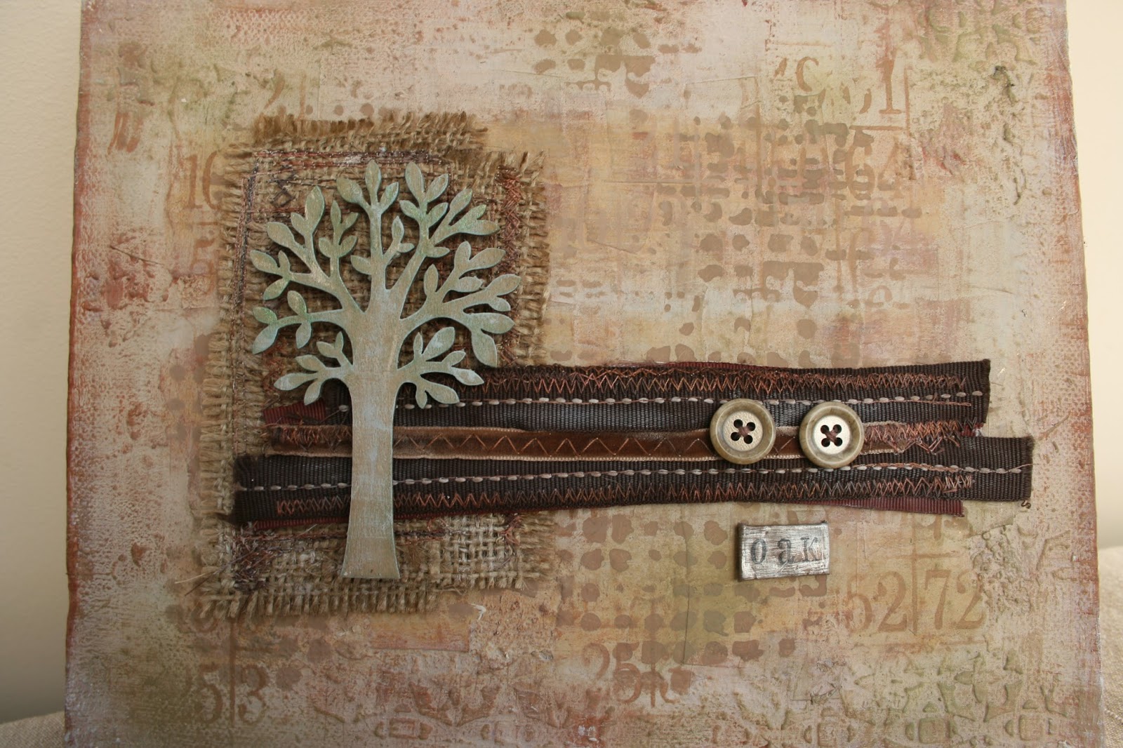
I pulled out some thin patterned paper scraps and ripped them into strips then with watered down PVA I just started sticking them on over the centre of of the canvas building up layers and texture.  Once they were dry I ripped some patterned paper into squares and stuck these over the top of the strips - nothing neat or ordered about it, just keep adding layers.
 
Once this was dry I went over the top in Mushroom and they watered down Nougat, concentrating the Nougat in the centre.  Around the edges to catch he Grunge Paste I dry brushed Toffee and Cinnamon. If it was a bit too dark I added some Nougat.

Over the central panel I painted Caramel in three strips. I started painting at one end with a dry brush and then I wet my brush wiped the excess off on kitchen roll and then went back over the paint to move the paint around. to create pale strips of colour.  I didn't want it too opaque hence the water, but I did want to see it.  Once this was dry I dry brushed Toffee and Cinnamon to catch the edges of the ripped paper. I then added a tin wash of Nougat just to blend it all in and make if "soft".

I added some stencilling in Irish Cream and Mocha Mouse with a large fat stencil brush.

The Artemio tree was first painted in Caramel and then Nougat. A little bit of gentle sanding and then Tinned Peas gently added with the stencil rush.  the excess Tinned Peas was added to the corners of the canvas on the Grunge Paste areas.  Really lightly and softly so it just catches your eye and linked to the green on the tree.  Over the Tinned Peas I added Treasure Gold in Aquamarine and White Fire. then Nougat was dry brushed on the leaves and trunk.

I sewed some Hessian oblongs together and then created a strip of various ribbons. Sewed two buttons on.  The oak plague was made from an old piece of mocha metal that I sanded and then stamped the letters.  I folded the edges  over to give a neat edge. (Oak was the house I was in at school, it seemed appropriate).

I have to say I really love how this Cinderella canvas turned out. The colours tone so beautifully and subtlety and the various textures of paper, Grunge Paste, ribbon, Hessian and wood come together as one piece but equally are beautiful in their individual way.

Right having flexed the creative part of me this morning I'm now off to indulge in my other passion rugby this afternoon - at least its not raining!

hugs 
jo
xx
 

Tuesday 24 December 2013

Roman Fresco

So here is my second project this week over at the PaperArtsy blog.  

Similar themes of texture using Grunge Paste, paint and tissue paper.  This time the tissue paper is used in a different way to create even more texture.

Do go take a look if you haven't already.

Hugs
Jo
xx

Monday 23 December 2013

Moths @ PaperArtsy

Helloooo!

Well its that time of year again when my crafting activity gets shoved to one side a bit. 

I find it really difficult to get inspiration in the dark evenings which only leave the weekends for paper crafting and then all the weekend house stuff gets in the way!  

But we've turned the corner in terms of the shortest day and we can start to look forward to more light -hurrah!

Mind you I have been crafting in my role as guest designer over at PaperArtsy.  It's my final slot of the term this month so do please pop over to see what I've been making.

hugs
jo
xx

Saturday 9 November 2013

Sssh, but Christmas is round the corner

Christmas, I have a bit of a love hate relationship with Christmas. Sometimes I can be really enthusiastic about it, want to decorate the whole house, cook loads of yummy food and try not to buy even more Christams baubles in a new colour scheme (I have 3 large plastic boxes of baubles that really is enough for one house isn't?).

And then some years I could beat Scrooge for a bah humbug viewpoint.

It drives my husband insane, but he loves me and puts up with it.

This year I have a feeling it could be the whole full on Martha Stewart, Good House Keeping homespun chic DIY fabulous designer "oh I just knocked this together in a couple of hours" expereince as I've made this and it isn't even November (well it is now but I made it when it was still October).


I bought this MDF cut out last year and didn't do anything with it (it was a Scrooge year).

I knew I wanted to create a sort of shabby (nothing new there then) natural look. Distressed layers with touches of gold. 

I started off painting it all ovr with PaperArtsy Claret Fresco paint.  Then added a lyer of Old Gold.over that.

Next a layer of Crackle Glaze.

Over this  layer of Nougat and Snowflake, not too thick as I wanted fine crackles.

Then some sanding to distress the edges and on the top to remvoe some of the crackle so it looks like peeling paint. 

Treasure Gold (i think Renaissance), bit more Claret and Vintage Photo Distress Ink in places especially on the edges just to shabby it up.

Over all of this I added a layer of Metal Glaze mixed with a small amount of Old Gold.  It really dirtied up the colour and added to the aged look.  

A little bit of text stamping in Claret and finally I sprayed watered down Snowflake across it to add spots of white.  

The more thin layers of colours you add to a piece can really add tone and depth as can sanding to reveal base layers of colour - my favourite way of creating!

So, onwards then to continue creating my scandanavian shabby Christmas, migh have to orgainse a drinks party to show it all off!  

Hugs
Jo
xx


Sunday 3 November 2013

I tried ....

I did, I really tried to do a clean and simple inspired by Jo Wardle Guest Designer pieces over at PaperArtsy, but I just couldn't stop myself from adding texture!.

So here's a failed inspired by Jo Wardle, but it's a pretty good inspired by Jo Myhill don't you think?

It's the usual culprits of PaperArtsy Fresco paints in the orange / brown autumn inspired palette and I really like the Vintage Lace panel in the middle to contrast against the Krunchy Waxed Kraft Paper leaf. The Walnut Distress /ink over the top of the crunches really shows the texture and gives it that natural look.

Yet again it's a shame you can't actually get to look at this in real life and see all the grungy texture from the Grunge Paste and how watered down Fresco paints really move around and soak fabric beautifully.  I also really enjoyed spraying the paints as well and I'm currently trying that out more on a work in progress.

Right the whole day is ahead of me and I have two projects on the go, Sunday lunch to cook and a game of rugby to watch this afternoon. 

It's a hectic life sometimes.

Hugs
Jo
xx


Friday 1 November 2013

Still obsessed with hearts

I quite like Autumn, the colours the sharp nip in the air, but boy I don't enjoy going to work in the dark and travelling home from work in the dark - I miss daylight and it plays havoc with crafting as taking decent photos to blog with is frankly hard work.  I have been known to take art work into work to photograph in my lunch break I'm that desperate sometimes.

Anyway today I have a day off work to play crafting catch up and that includes photographs (it's a brightish day so great light), blogging, oh and some craft as well (really need to crack on with those Christmas cards).

So yes I still appear to be a bit obsessed with hearts. 

I made this quite a while ago in terms of the background and the frame.  It's my usual distressed texture style. The frame had layers of PaperArtsy Fresco paint on in a neutral palette, rubbed back in places and little bits of embossing powder on it.

The centre piece had a lot of Frantage embossing powders added over the corrugated card which again had been lightly painted in neutral PaperArtsy Fresco paints.

It had something else in the middle (fabric and paper stitched together with a small piece of driftwood) that looked ok, but just wasn't quite right and every time I looked at it I sighed and pulled a face.

So I ripped off the middle bit and had a re-think. 

I had some spare hearts cut from Grunge Paper knocking about from a previous project so I played around with these adding more distressing with paint and powders and wrapped some strips of silk and wire round them. 

And again it sat in my craft room and I looked at it and sighed and pulled a face. Not quite as bad as last time, but yes, it still looked too "clean" especially the copper wire.

So this morning I carefully dripped some Hazelnut Alcohol Ink on the wire and silk and added some burgundy WOW embossing powder to the heart.  I also sprinkled a bit of the embossing powder on the corrugated background. And then added some light swipes of Plum Archival Ink on the frame to tie in the colours.

Now I look at it and smile, it's dirty enough to make me happy.

hugs
Jo
xx


Sunday 6 October 2013

It's a tactile thing

I am still really enjoying creating texture, it's just a shame you can't get to see this in real life and touch it because it is full on 100% oozing texture!

This started out as a plain 5" x 7" canvas, but you will not believe how many layers of paper and texture paste this has had on it (well you might if you know my work well).  This is the third layer of art on this canvas and the previous layers (which I just paint over when it isn't quite working and start again) have added to the strength of the canvas.

I painted over what was there before (text paper, old grunge paste, some paint and goodness know what else) with gesso, only a light layer as I didn't want to mask the texture just give me a neutral colour base to work on.

Then a layer of Grunge Paste scraped on with a spatula, not all over the canvas, very messy and definitely not smoothed out.  

I bought a new product recently to give me some more grainy texture.  It's called Sand Texture Gel and well that's pretty much what it is. This was applied on the right hand side of the canvas. Let this all dry to give you a really interesting base to work with colour on.

I used the new Caramel, Toffee and Tango Fresco paints with Vanilla and Autumn Fire to add colour.  Did some flicking to get spots of colour and stamped Mini 23 in Archival Monarch Orange.

The fabric is cream sari silk that I dyed with watered down Fresco paints and then stitched onto felt and cut up and re-stitched together! Little bit of Antique Photo Distress Ink around the edges and then sprinkles of Stampendous Fran-tage Embossing Enamel in Aged Scarlet.

Some stitched fabric and paper for the central piece with more watered down Fresco in Rose and the lovely new Mini 96 flourish stamped in Archival Potting Soil.

The heart was painted with Nougat and Rose Fresco, more Stampendous Fran-tage Embossing Enamel in Aged Scarlet melted on it.  Then it was sanded and inked with Antique Photo Distress Ink to complete that shabby look.

The canvas background really looks and feels like weathered sandstone (we have a lot of it here in Northamptonshire) and I still love using ripped and cut fabric in this way with paint and silky coloured thread to add even more texture. 

It really is a shame you can't touch it through the magic of the Internet!

hugs
jo
xx    


I'd like to thank ....

Wow and wow again. 

It's been really hard work keeping it a secret that I was one the new guest designers for PaperArtsy and probably even more nerve wracking planning, designing and writing up my three first pieces.

Hidcote Manor June 2013
I have been overwhelmed and very humbled by all the positive responses I have got from everyone who has looked and commented, so a big thank you to you all.

I really appreciate it.

Putting your work out there and getting feedback both positive and constructive is really important. It's how we grow, it's how we stretch ourselves, it's how we learn.

My day "job" is in a University and this week I have been meeting new students to tell them how the library can and will support their learning, how much learning is a creative interactive energising process and having the opportunity to learn is one of the most precious gifts we can have in life.  Wanting to learn should never leave us and that's why it has been great this week to share my enthusiasm for learning in both my day job and my crafting life.

If you haven't looked at my guest designer week these are the links:

Project 1
Project 2
Project 3

I'm really looking forward to my next designer week and have already got some great ideas to share with you.

hugs
jo
xx

Wednesday 25 September 2013

Still kicking that seaside vibe

Well I so enjoyed the colours on the last piece I made with JOFY seaside stamps, I needed to do some more.

I used the same Green Olives, Tinned Peas, Sage and Concrete PaperArtsy Fresco paints colour combo on this square canvas.

I also added some stencilling with Grunge Paste(gotta have some texture!)

The wooden fence is actually lolly sticks that I wiped Sage and Concrete lightly with Cut-n-Dry.  Cut the ends and then used rusting powder to distress further.

The little row of beach huts were stamped on a scrap of patterned paper that I'd swiped some Concrete on and them stamped and embossed with brown embossing powder and cut out. 

These were stuck onto a scrap of linen that had a little bit of Walnut Stain smeared over it and finally the sentiment added on a scrap of the patterned paper.

A tiny smidge of Sherbet over the stencilling just to add some contrast  and pick up some of the colour on the patterned paper just finishes it off I think.

Really pleased with the rusty fence, I think it looks great as another layer of texture on the canvas and continues the beachy theme.

I've added another photo in to show how sunny it was on Sunday (husband was happy as he could keep his shorts on for WW weigh in, he's dreading having to be weighed in jeans and suffer a bit of a gain!) and how the colours look so different 

Well until next time, hope you are all enjoying playing with your stash from your latest shopping venture wherever that may have been (clears throat to admit I haven't put mine away from Ally Pally yet ...).

hugs
jo
xx

Thursday 19 September 2013

ssssh, it's been a bit quiet round here lately

Yes I know I haven't posted in ages but I've been rather caught up in changing habits of a lifetime and creating a new lifestyle.  Both husband and I have decided that enough is enough and we need to eat smaller portions and move a lot more.  So that's what we've been doing, between us we have lost over 30lbs in 7 weeks and visiting the gym on a much more regular basis (they don't laugh now when we get our cards out as there is no dust flying out as well through lack of use).  This week I have started the excellent NHS couch to 5k running programme (aren't pod casts great) and a new weights regime.  I can't quite look at myself in the mirror when I'm lifting the weights as a) I'm trying to concentrate on breathing right b) I forget to breathe and go red and c) I'm sure I'm pulling right gurning faces as I lift the weights above my head and that will make me laugh and possibly drop the weights.


But last weekend I did manage to do some art and here it is using the fabulous JOFY stamps from PaperArtsy.


Rather than a beach scene I ended up making it look like a garden shed, but that's the versatility of the stamps.  

This one is JOFY Mini 23 which I stamped on a ripped out book page lightly painted on Concrete, stamped in black and then painted in Sage and Tinned Peas (sometimes neat sometimes mixed) . 

The really deep mini canvas was painted first in Tinned Peas, Crackle Glaze layer and then in Concrete and Sage mixed.  

Sanded on the edges and then stamped using the large clocks stamp from Clock Plate 2 and embossed with green  embossing powder. Some beautiful lace on the edge, ripped crunchy waxed craft paper and string and finally some buttons and some driftwood.

Well here's hoping I can manage to find a balance between eating less, moving more and crating as well!

hugs
jo
xx

Sunday 18 August 2013

Some things don't change

This was taken by my Dad in July / August 1972 on holiday in Looe in Cornwall.  Its me, my brother and my baby brother who was 6 weeks old. Apparently my Mum had been to the hairdressers hence the very beautiful coiffured hair.

The base canvas had stone and cream acrylic paint added to it and some old Frayed Burlap crackle paint on top.  (I was clearing out old paint and couldn't quite get rid of the neutrals). I also added some ripped bits of Tim Holtz tissue paper stuck down with Gel Medium and some Tinned Peas green added in places. 

The fabric layer was made up of an oblong of cotton that had some Fresco stencilling in green dots and lot of layers of silk strips, merino wool, stitching in different variegated threads to make the vertical stripes. I then sliced it up (big deep breath to do this but it was worth it) and stitched it back together.  the horizontal stripes of fabric and lace where added to give loads of texture.  This was then sewn onto a base layer of felt to give some strength to the fabric and just raise it up a bit from the canvas.

The photo was photocopied and then transferred onto water colour paper using PaperArtsy Satin Glaze.  I also sealed it with Gloss Glaze after I'd sanded it a bit to distress (hence my rubbed out brother bottom right!). Edges roughed up and Vintage Photo Distress Ink added.  This was attached to some kraft card that had strips of ripped Crunchy Waxed Paper sewn on and more stitched added everywhere!

I have always loved this picture, I don't remember it being taken (hence the into a memory stamp from Sara Naumann Eclectica 6) but it looks so serene and you can feel the love from my Mother looking into the lens and the love my Father has because my Mother is completely in focus whilst us children are slightly out of focus.

I look at this picture and so many thoughts and questions come into my head of my family, of me, where I came from and where I am.

But one thing I do know is that I still smile like this and I still stand like this with my head to one side, some things don't change no matter how old we get.

hugs
jo
xx

Sunday 11 August 2013

Salty corrosion

Decayed, distressed, peeling, shabby, no I'm talking about me as I creep towards OAPdom (when I do get there I will be doing it elegantly even if bits are falling off and failing!), but about textures I really love and adore. Those gorgeous natural textures that happen over time as the sun, wind and rain (lets not talk about chemical erosion shall we) batter wood and metal from their pristine newly painted / created state.

I've had this photo of a mussel shell for over a year. I took it on holiday in Southwold last July when I went for an early morning stroll along the beach (husband was till snoring in our classy shabby hotel and we've been married too long for me to attempt to wake him for some romantic adventure). The flat east coast light as it came over the horizon was superb and I spotted this and immediately thought it looked like a heart.  Experiences like that for me are like topping up my natural battery of happiness, storing away the feelings and memories for days when the battery of life seems a bit flat.

I've manipulated the photo slightly with some blue colour saturation on the PC and printed it out on photo paper.  I distressed the edges with a tonic tool, added some rock candy over the top and then some distress embossing powder and walnut stain on the edges to grunge it up a bit more.I took a scrap of kraft card crumpled it up and put walnut stain round the edge then used some staples to attach the photo to the card. The my heart sentiment was from the Sara Naumann 7 Eclectica plate.  I stamped it on piece of balsa wood that came with some canvases - you know the "bits" in a plastic bag stapled to the back of a canvas (what are they for???). Sandpapered the edges and did the same thing with a bit of kraft card.

The middle layer is a piece of mountboard that has been thoroughly painted to look distressed! I intended to use really bright colours to remind me of our recent holiday, the expanse of saturated blue sea against swathes of clean yellow sand was so intense. So a first layer of Brown shed to act as a base and then layers of South Pacific, Beach Hut and  Bora Bora were added. Then some thin layers of Cheesecake and Vanilla, followed by some more layers of the blues.  Finally a layer of crackle glaze and some more Cheesecake and Vanilla, thickly in places, less thick in others to get different grades of crackle. 

Round the edges I used Brown Shed, Walnut Stain and rusting powder to get the weather beaten look I was after. Once I'd sprinkled the powder on, spritzed with vinegar (ahh chips) I tilted the board to let it drip down and carry some of the powder with it and left it to set.  the longer you leave the powder the "redder and rusted" it seems to go. I added some stamping in Coffee Archival from Hot Picks 1201. My new screw brads were added in the corners.

The frame was another old one knocking around, the old art taken out and the frame revamped with Beach Hut, South Pacific, Brown Shed and Stone.  All really thin watered down layers, sometimes left to pool in places other times dripped down the frame.  You have to be really patient and trust what you are doing and that the paints will dry much softer than they look when you use them in this very wet fluid state.  Lots of sanding to reveal some old texture paste underneath and finally some fish / sea related stamping in Black Archival from Hot Picks 1111 and Hot Picks 1202 

This took me quite a while to make but I am really pleased with the outcome. For me making art is a relaxation, not a job with deadlines (although I'd possibly quite like to make it a job and I really should start thinking about attempting to sell some of my art if only to make space for making more!), so slow contemplative creation works for me, just like decaying and rusting!

hugs
jo
xx


Wednesday 7 August 2013

Shabby bunnies

Some things just make you really happy don't they?  Well this does for me.  

I've loved this stamp Crafty Individuals Alice Palace Crowned Bunnies stamp ever since it came out and it took me ages to find it (very popular it must have been) and for a couple of days once I'd parted with hard cash for them I just looked at them and sighed (and occasionally stroked it has to be said) .

But then I plucked up the courage to use it. 

I took some fabric and scraped some Grunge Paste over it and let it dry.  On the reverse I added a thick layer of PVA to strengthen the fabric.  When that was dry I turned it back over and stamped those lovely bunnies with WOW Pepper embossing powder. Added some text stamping using the lovely Mini 26 with Cinnamon fresco paint.

This was stitched onto some crunched up PaperArtsy crunchy waxed craft paper that had some Snowflake added over the creases and I also added some grungy staples. This layer was then stuck onto some distressed Kraft card that was edged with Walnut Stain Distressing Ink.

The frame was an old one I had knocking around.  It had already got some sort of texture paste (Grunge Paste would do it) on it that I'd stamped into.  Originally it had some green Inka Gold on it so I added a couple of layers of Concrete to cover that up.  Then I added some thin layers of Mocha Mousse and lots of sanding to distress even further.  It looks sort of blue because I think the original Inka layer is showing through but it looks fantastically distressed I have to say.  Finally some more stamping with the same Mini 26 around the frame.

I think these gorgeous bundles of loveliness may have to come to work and sit on my desk so I can gaze at them in times of stress (that's most of the time then).

hugs
jo
xx

Sunday 4 August 2013

Wise owl says ....

... a lot of things including: you really should finish some projects, your craft room could do with a bit of a tidy up, did you really need to buy more stash last weekend and  it doesn't matter how many layers of paint on a canvas there is, keep going until you are happy.

There is a lot of layers on paint on this canvas because I couldn't quite get the effect I was looking for - an old tree with lichen and moss subtle toning but bright not dingy. I take loads of pictures of trees when we are out and about.  On a regular basis my husband will find me smiling at a tree, stroking it and have my camera lens as close to the rippling peeling bark as I can get it.  So when I saw Helen Chilton's Barn Owl on the PaperArtsy blog this week I thought I'd spend Saturday creating my interpretation using some the techniques and ideas.

To get the dark brown background colour that I kept returning too I mixed Cinnamon and Little Black Dress to get a really dark shade, the chalkiness of the Fresco give a really matt finish which strengthens and deepens the colour a lot. 

I used grunge paste through the wood grain stencil to add a layer of texture, not too much as I didn't want deep lines. When it was dry I also gave it a light sand.

Then the fun began in terms of adding layers and layers of colour. I tried:  Concrete (like this but I needed a different background), Mocha Mousse, Cinnamon, Beach Hut, Mermaid, Guacamole and Tinned Peas. All weren't quite right and ended up looking too dingy and muddy and not quite the effect I was trying to get.

I started again this morning with a dark brown layer and this time I lightened what was left on the craft sheet with  bit of Concrete and gently wiped that on with Cut and Dry.  I didn't put too much paint on the Cut and Dry and wiped it on a bit of kitchen roll to get the excess off as I wanted a light shading of colour not a full opaque coverage. Next I added in places very watered down Honey Dew to look like lichen staining.  Finally I added embossing powder to the wood grain lines to highlight them. The embossing powder can stick everywhere so I use a brush and my fingers to brush away what I don't want.

Wise owl was stamped on tissue paper and thin layers of Honey Dew added to the back. He was stuck on some corrugated card with added grungy staples and a bit of thin string.  I wanted him to look like a notice stuck on a tree rather than living in the tree if you get what I mean.

So I'm now off to follow more of wise owl's saying and finish some of my other projects on the go!

hugs
jo
xx


Wednesday 3 July 2013

A study in texture II

So it isn't the bigger canvas I want to work on but it is carrying on the theme!

Tonal neutrals are my favourite to work in and when I marry them with texture, well let's just say it makes me happy!


I limited myself to Concrete, Elephant and Snowflake and a small tiny smidge of Little Black Dress Paper Artsy fresco finishes here to paint the canvas. A layer of roughed up Grunge Paste which was stamped with the Mini 22 numbers and embossed with Pepper embossing powder. 

Round the edge of the canvas I sprinkled Frantage Aged Silver embossing enamel.  Because it's not sticking to anything you nee to hold the heat gun at quite a distance to stop it blowing away, one it starts to melt and therefore "stick" you can move in a bit closer.

I coloured a sheet of Grunge Paper in Snowflake and Concrete and then cut out various shapes using Tim Holtz on the edge dies. I was looking for A Ben Nicholson neutral abstract composition here (love his work and want to explore on a bigger scale).  Some shapes I stamped others I dry embossed in a swirly folder.

Those that were embossed had White Fire Treasure Gold added and some Little Black Dress paint on the edges just to "dirty" it up a bit!

The Chipboard shape was painted in Elephant, Snowflake lightly dry brushed on and some white Fire Treasure Gold gently dabbed on.

The tag was painted in Elephant, some crackle glaze and a Snowflake with a dab of Concrete to make a lighter grey top layer.  Mini 23 was stamped over the top in Elephant. 

Everything was stuck down with a glue gun to help give more height and I think the flowers just finish it off in terms of colour and that final top layer.  

So, yes a continuation of a theme, but its a theme I don't think I've fully exhausted yet, expect more and as I said previously - bigger!

hugs
jo
xx
 

Saturday 29 June 2013

A study in texture

I've been reading some stress management self help books recently to try and get some hints and tips on how to manage my time and workload and still enjoy life. One of the hints was to use your senses to distract you, to focus on something more calming, I suppose to find your happy place.

Making, seeing and touching art is one of my happy places, as is making and eating food and the quiet of early morning with just the birdsong.

Recently I've been using fabric and stitching again in my art along with texture paste, in this case Grunge Paste.  To create different layers and textures, smooth and rough, light and shade (there is probably some art therapy tick box I've just ticked there in that sentence in terms of the frenzied state of mind). 

I love the fact that texture / grunge paste is so smooth and silky looking in the tub, yet when you apply to something you can really rough it up to create a completely different look. As I said in a tweet a couple of weeks ago I wasn't aiming to pass smooth icing class 101!

I wanted to see if you could use embossing powder on dried texture / grunge paste to highlight the roughness so you could see the texture more, to pick out the lines I'd created with my palette knife .  It did and I also got the addition of a molten glass like look as well where there were large areas of embossing powder.

I really like what I've created here, it is such a tactile piece. I love the neutral brown base layer (Chocolate Pudding and French Roast and a smidge of Squid Ink in the corners) over the texture paste but I love even more the coppery tones created by the gold stitching, embossing powder, paint and twisted wire.

What I really want to do now is work on a much bigger canvas to create similar kinds of work in different colour schemes, um how big can I go?

Right another happy place for this morning - rugby. It's the Lions Second Test, it could be noisy!

hugs
jo
xx

Sunday 2 June 2013

Where a pale lady peeks through

It's been a while I know.

I made this "recently" some time in May (see I can't actually be sure when I did make start it or indeed finish it) and I've been meaning to show it all week, but ...

Anyhow, what did I do?

Well the base is mount board that has loads of layers of Paper Artsy Fresco paints in Butternut, Pumpkin Soup, Haystack and Old Gold. You know the drill, add paint, wipe off, dry, add paint, wipe off, dry and repeat.

I then added some text stamping using Monarch Orange Archival.   The lovely medallion from Lynne Perrella 004 was stamped in Archival Blue Violet.  I love this colour for background stamping, it's dark but not too dark. 

Over this were layers of Smoked Paprika and Autumn Fire. these make the background stamping fade nicely so sometimes there is just a hint, just a shadow of an image. and then on top of this layer I stamped the postage stamp from Lynne Perrella 009 in Blue Violet in a grid pattern, some of the images are the second and third stamp to continue the faded look.

For the pale lady I carefully painted a page torn from an old Brewers Phrase and Fable* bought from a junk shop with Smoked Paprika. I then painted just the face from the beautiful large collage stamp from the Lynne Perrella 009 plate with Snowflake stamped this on the page, quickly cleaned the stamp and then added more layers of snowflake on the page to create a pale background for when I stamped the image again in Black Versamark. The edges of the page were torn and she was glued on using PaperArtsy Satin Gloss.

When it was dry I added some Treasure Gold in Renaissance, Ruby and Florentine around the edge of the stamped image. I also flicked some watered down Old Gold to give some splats.

In the corners of the mount board I sprinkled on some Fran-tage Aged Spice Embossing Enamel and melted it to give more texture. The edges then had more Treasure Gold on them to frame it.

This took me quite a while and there were a few mishaps and versions on the way with the pale lady but I got where I wanted to be and the journey was good!

Hugs
jo

*Brewers (as it's know in the trade) if you haven't heard of it is a reference work that is packed with definitions and explanations of many famous phrases, allusions and figures - pick a page at random and learn loads of stuff both useful and useless.

 .


Friday 17 May 2013

Keyring quicky

Well second post today (see what you can achieve when you aren't at work).

Here is my take on the PaperArtsy keyring challenge.  The pastel colours are way out of my comfort range but I found a pack of fibres whilst rummaging in my stash so though I'd use them up.

AND I used shrink plastic for the first time in ages!

Now what else could I do with that shrink plastic ....

hugs
jo
xx
 

Crunchy Kraft

I was so pleased to see France as the one of the guest designers for this semester PaperArtsy craft school (it sort of feels like craft school doesn't it, inspiration, new techniques etc).  I have long admired France's work so it was a joy to see her take on using PaperArtsy products.

I loved how she used the crunchy waxed kraft paper for the cover of the notebook, so here is my take on it.

I found in the supermarket a nice kraft notebook with a good solid cover, it had a design on it but I used a mixture of Stone and Mocha Mousse Fresco paints to make a nice fawn colour and covered both the front and back.

I added some Brushed Corduroy and Vintage Photo distress inks on the edges, sanding and water flicking to get a distressed look. Stamped some numbers in Coffee Archival.

I had the piece of cotton already on my desk primed with Snowflake Fresco and it fitted perfectly on the front.

I took a piece of crunchy, stamped it and then scrunched it. Smoothed it out and then brayered it in Stone.  Scrunched and smoothed again and added a little bit of French Roast with the brayer.

I couldn't find my tracing paper so used a piece of handmade paper that I had knocking around. I stamped it with Coffee Archival using Background Plate 3.  In places I sprinkled some WOW embossing powder in Earthtone Pepper (loving some of the shades of the WOW embossing powders especially the Primary Bark and Earthtone Pomegranate, they aren't bright and quite shabby in tone), just to add a differing shade and of colour, it's quite subtle and probably won't pick up on the photo.

These were sewed on to the cotton in toning thread.

The kraft tag had a thin layer of Stone scrapped on with a credit card and then a thin layer of Mudsplat.  this was sanded to distress and then in coffee Archival I stamped Mini 62 all over.  On top of the Mudsplat I stamped Mini 69 in Versamark and used Frantage Aged Ivory Embossing Enamel. Some eyelets, wire coloured with alcohol inks, a button and some string to finish it off.

And finally ribbon, yes a lot of ribbon.  I've had these spools of ribbon knocking around for a log time in a box (found them whilst trying to find the tracing paper). I basically found the end of each spool, held the ends in one hand, yanked it all out and cut lengths which I tied on the wires. Once they were all on I gave them a haircut to shorten the length. 

So thank you France for the inspiration, but don't aks me what I'm going to use it for!

hugs
jo
xx


Sunday 28 April 2013

Shanghai Butterfly

So inspired by this piece by Suzanne Czosek on the PaperArtsy blog this week, I came up with this.

The canvas had a layer of Limelight as the base and then I mixed some Limelight and Mermaid to get a more minty bluey green and washed that over the top.  

Then I stencilled some large dots with the minty green with a touch of Tinned Peas mixed in (I love working in this tonal way just varying the shades and density of the paint). Finally I stencilled through a damask type mask with Tinned Peas.


I then started to give the canvas some washes in Limelight and Beach Hut just to flatten out and almost hide the stencilling.  The only oriental themed stamps I have are plate Vintage ID05EZ, so I stamped the long word and little receipt in Olive Archival over the canvas. Then I used Versamark through a small ditty mask and covered in Sticky Embossing Powder and stuck down some gold foil. 

The centre is a piece of mount board covered in thin layer of Grunge Paste in the centre.  I was working on this at the same time as the canvas so I just used the various washed I was using on the canvas on this, just made the final layers a bit darker to contrast against the canvas. Some Treasure Gold in Acquamarine, Green Amber and Spanish Topaz over this (gave it a good buff to make it shine). I stamped and embossed the text stamp in Olive Archival again and added smidges of jade embossing power plus some bits of foil. It was edged in Frantage black enamel embossing powder (as was the canvas, just to tie it all in together and frame it.

The butterfly was cut from a scrap piece of gold metal and run through an embossing folder.  Limelight added and then added some Frantage Aged Spice Embossing Enamel. Edged it with a little bit of Little Black Dress just to define the edges.

Phew, all this was done this morning in between painting my bathroom (I'm thinking of doing some Jocasta Innes inspired stamping to create a bit of fresco look in our roman inspired bathroom The great woman died this month and I was listening to her daughter talk about her on Radio 4 on Friday, her paint effects inspired a nation during the 80s and 90s with rag rolling and stencilling).

And I think I've just scraped in under the radar for the challenge!

Hugs
 jo
xx 


Sunday 14 April 2013

Madam Holbein

Well Spring might just be on it's way here in the blustery Shires, I've managed to get two lots of washing out on the line dried and I think we can finally turn the heating off!

Yesterday was Ally Pally in London or "any excuse to buy load of not needed but truly wanted stash"!  I knew I wanted the new PaperArtsy fresco colours (especially as some were "inspired" by my cat - Taupe will forever be Maise Moo colour in our house).  These were indeed purchased along with some stamps, gilding flakes and Frantage embossing enamels. 

You know me, I  just love my monochrome neutral palette so I was dying to start using all the greys (with a bit of pansy) for contrast. 

The canvas had a very dark grey (mixed Little Black Dress and Snowflake to get a charcoal) all over.  there are lots of bumps and textures as it was another re-used canvas!.  Then I just started adding thin layers of Elephant, Concrete and Snowflake in that order.

I added some grunge paste through a stencil at the edges.  One that was dry (shock horror I went and did some housework) I added some stencilling and stamping in a darker mixed shade using Little Black Dress and Snowflake.  It doesn't matter if it isn't a clean image I just wanted that "shabby distressed rubbed off look". In some places I rubbed back quite hard with a baby wipe to reveal a hint of the charcoal.  The dried grunge had Pansy over the top and then some Treasure Gold in Classic, White Fire, Renaissance and Onyxite.   

In the middle. I randomly used my Versamark pad over and added sticky embossing powder, heated and one it was tacky put loads of gilding flakes over.  Patted them down and then rubbed off the excess. Over the top of his I added some Frantage embossing enamel in Aged Scarlet and Aged Taupe. It's a chunkier embossing powder that melts into blobs as well as a flat enamelled look. I just sort of sprinkle it on, hold the heat gun at quite a distance to start melting it.   Over the top of this I added some more grunge paste through a stencil.  One this had dried I pit the stencil back over the top and went over with some Treasure Gold, a bit like bumping it doesn't quite cover all the paste but I think it looks good.

Finally Madam Holbein (I think she looks a bit Tudory with that hat and ruff, hence Madam Holbein, Holbein the Younger not the older - look it up!).  I painted a piece of mountboard in Elephant and Stone to give a neutral base.  Stamped the lovely Lin Perrella in black ink and then started to paint her.  Once I was happy with the colour I went over the top with a watered down wash of metallic glaze to give a subtle sheen. Around the edge I put some more Frantage embossing enamel and edged in black ink. 

I'm really enjoying working with metallic textures at the moment, I know it's not everyones cup of tea and some of you might find it a bit too bright and blingy, but I have to admit - I'm lovin' it!

Hugs
jo
xx


Saturday 6 April 2013

Pansies

Well I know it's been a little while since I blogged, but I have been making stuff just haven't been able to take any decent pictures because of lack of light seeing as we still appear to be in the grip of winter (I wonder if we'll look back at this time and go ah yes, now I can see that was the start of the ice age that sunk East Anglia, at the time we just grumbled about it being a bit cold and snowing for a long time).

I digress.

Anyway I made this recently using Lin's lovely flower from the Lin Eclectica No. 1 plate. I love the shape of the flowers and thought they would be great as 3D flowers.  

I used Eggplant and Pearl Glaze to stamp the flowers on black card and then sprinkled clear matt embossing powder on them as well. Cut them out, curled the petals and added some buttons (from the old lady knitting shop - you know the type) which I dabbed with Indigo Treasure Gold.   the leaves were painted in Tinned Peas and the Pearl Glaze.

The canvas is an old one that had something else on and I just RIPPED IT APART!  I know how radical of me, but you know I didn't like it anymore so why keep it! I added a layer of texture paste in the middle of the canvas to cover up some of the old art work. It's so long ago since I actually made this that I can't remember what coloured paints I used but I suspect looking at it Inky Pool and Baltic Blue and possibly South Pacific. the centre panel had Indigo and Onyx Treasure Gold added through a stencil.

Various bits of stamping and some more foil (love using this) to add texture to the canvas and finally some fabric embellishment to add contrasting texture.

So, a short and hopefully sweet post today as a) I have to tidy up after our bathroom refit this week (very pleased with how it's turned out, just need to wait for the plaster to dry out before I paint) and b) I can't actually remember everything about how I made this!

hugs
jo
xx